Learn more below
Are you Mobile Ready?
Is your web experience mobile ready? In today’s modern world more and more of peoples experiences with the internet are increasingly mobile ones and having a mobile ready website is essential. With every new day brings more diverse digital devices, and each one of those devices is a different shape and size. One of the most common ways to custom tailor your web experience to any device is with what is called Responsive Design which means your web experience will change in shape and appearance to give your users the best view for their device no matter what. We are experts at developing responsive web experiences and will guarantee your next project will look good on any device. Please read more below or contact us today!
Responsive Design is ready for:
- Desktop (variety of sizes, including Ultra High Definition)
- Tablets
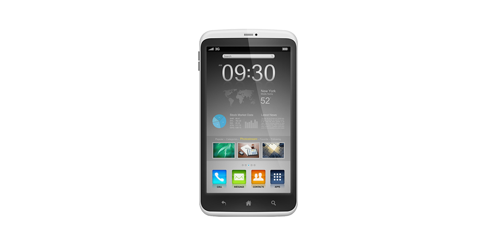
- Smartphones (Mobile)
- Games Consoles
- Smart TVs
Internet usage on Mobile and Tablet Devices are booming
- 1/3 of internet access is now on mobile devices and it is rising
- Over 90% of all people on earth have a mobile phone
- More than half of the us consumers have a smartphone
- Over 70% of tablet owners purchase online from their tablets each week
- Mobile traffic is exploding
Don’t miss out, reach your audience
But I have a website and it comes up fine on my mobile…..
Mobile access simply comes down to one thing….user experience. Creating a great user experience no matter what device your customers are using is critical to keeping your users attention and ultimately driving them to action. You need to make an impression the first time people experience your company online or it is likely that users who have a bad experience are not likely to come back. With the ever increasing types of devices and mobile operating systems at your customers fingertips you need to be sure you are ready for anything.
Variety of Mobile OS’s
- Android
- iOS
- SymbianOS
- Windows Phone
- Blackberry
- An many more…
Its all about your customers user experience with your company

One vision, One experience, No Matter What
- User experiences on most non mobile sites are horrible, requires zooming, clicking, hunting, slow loading, etc…
- Simplify what matters
- Easily navigate
- Easily Read
- Easily Act
- Video and graphics show correctly
Consistent experience from desktop to mobile
Simplified
Mobile optimized sites load faster and are easier to navigate then traditional desktop only websites. As most of you know waiting for things to load while on the go can really dissuade you from using a website. Responsive sites will automatically resize and show only the most important information and pictures which ensures your mobile site will load quickly.
Don’t lose a customer because of a loading screen
Access from anywhere, any device
Today’s customers are on a variety of devices, whether at home on a desktop, laptop, game console or smart TV or whether they are on the go with a smartphone or tablet you need to be accessible no matter what.
Be available to your customers where ever they are…
Stand Out
Chances are some of your competitors are already mobile ready and if not then you have a chance to stand out of the crowd and capture the mobile audience before they do. Don’t be left in the dust on the mobile front.
Make that first impression count…then amaze your client when they stay

Separate desktop and mobile sites
In some scenarios having two separate mobile and desktop versions is very handy, it requires a bit more work up front but what you get is two highly polished user experiences that can be completely independent of one another.
Two sites, Highly Optimized
One site that adapts to whatever device you throw at it
Responsive design is the one of the latest and most popular ways to serve up content on any device. The future brings a huge variety of devices in every shape imaginable and a responsive site can adapt to any screen size. Responsive design has a huge advantage over separate mobile and desktop sites in that it is all the same code, one website that adapts to whatever device which typically requires less work.
Be ready to the future
Learn more about us or get started by clicking below: